Guild Gaming: Leveraging AI to Make Event Performance Analysis Fast, Accessible, and Actionable.
Discovery
Before diving into solutions, we needed to understand the landscape. Clay, the founder of Guild Gaming, was building a platform for gaming event organizers. To support this vision, we conducted extensive user research to uncover the real and often overlooked challenges organizers face after their tournaments end.
One theme quickly emerged: making sense of data post-event is critical. Event Organizers rely on data to understand whether their event was a success or a failure, both financially and in terms of reach.
The number of entrants,
How much we spent — and how much we made back from the venue and food,
How many people watched, and how many followers did we gain on Twitch or Twitter?"
Event organizers, many of whom lack the expertise to interpret data visualizations, often struggle to make sense of their post-event analytics. This leads to missed opportunities when planning future events.
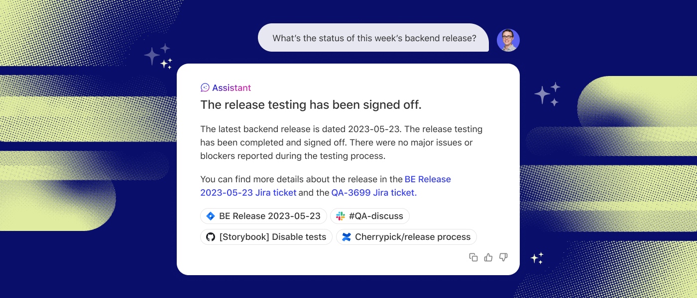
Therefore, we designed a dashboard that leverages AI to help event organizers uncover insights and answer tough questions, transforming raw data into actionable next steps.
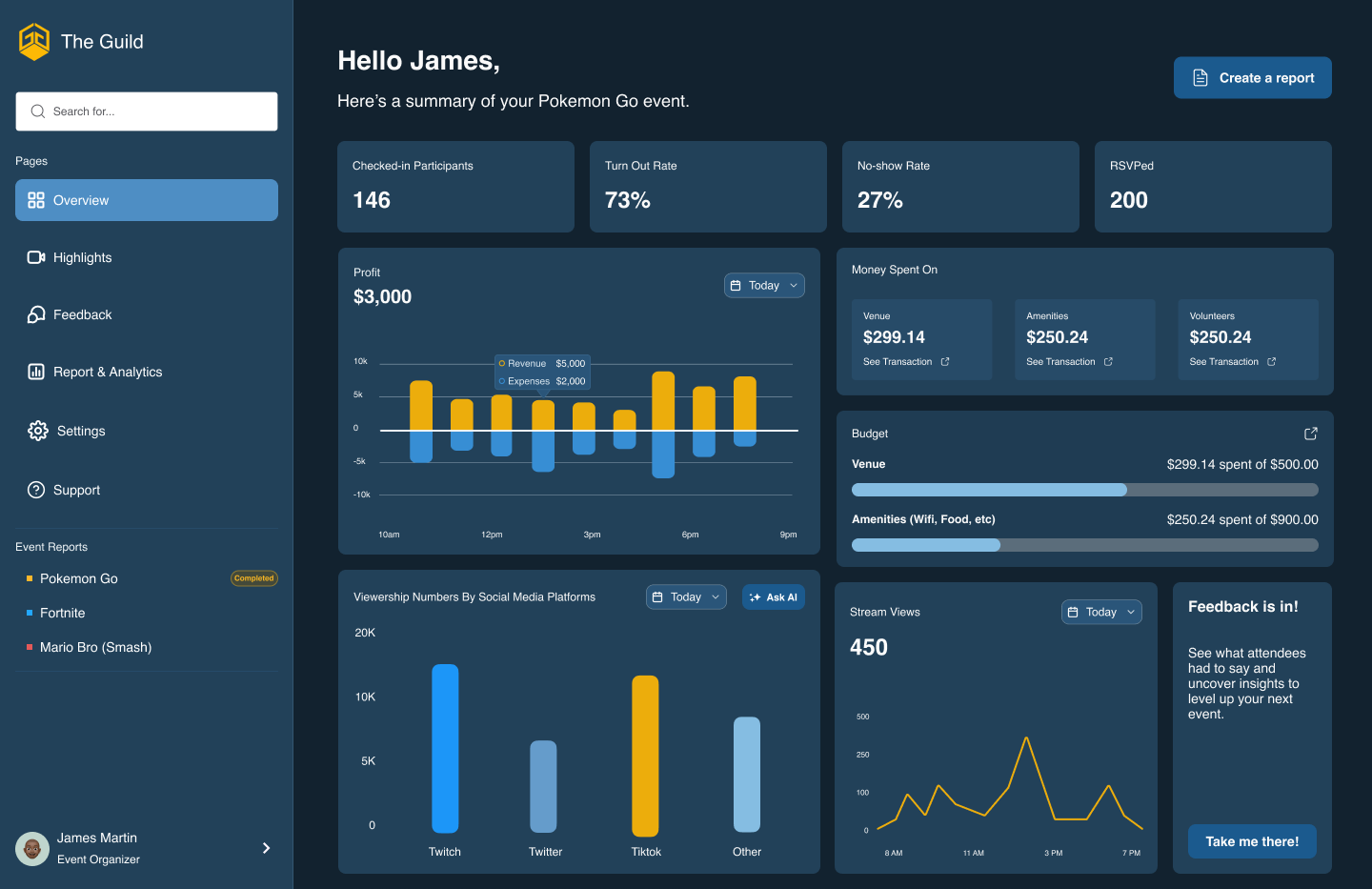
Designed a dashboard that brings together the best of AI and traditional dashboard designs
Harnessing the Power of AI in Data Visualization
Rather than reinventing the wheel, we analyzed how AI is applied both within data visualization tools and beyond, drawing inspiration from platforms like Notion, SunDial, and Glean. We examined their use of AI and design patterns to inform our own approach which we will dive into in the next section.
From there, we identified three key elements that would allow users to interact seamlessly with the AI in our dashboard.
- Cards displayed insights based on the outcomes of their events, giving users a structured overview of their data.
- Each card featured an "Ask AI" button that users could click to get deeper explanations or ask follow-up questions about the data.
- An AI chatbox provided a familiar space for users to either type their own questions or choose from guided prompts, encouraging exploration and discovery of insights beyond the surface.
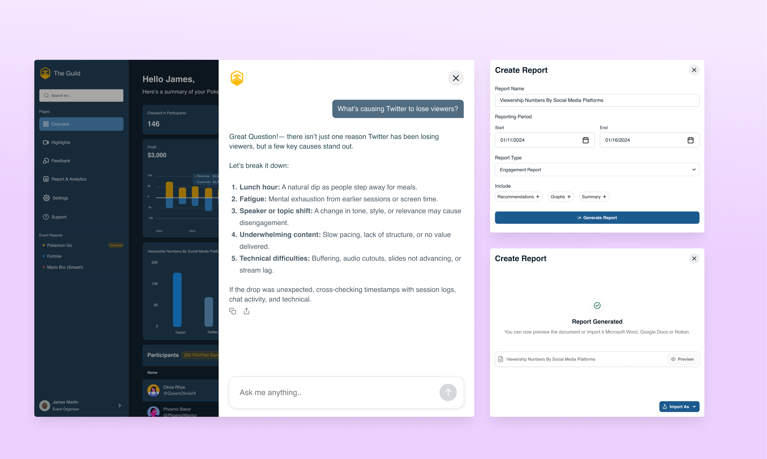
Designing for a use case: Create a Report
Typically, after an event, organizers manually create reports to share with stakeholders, highlighting metrics such as revenue generated, audience engagement, or drops in viewership on platforms like Twitter. However, this process often involves analyzing fragmented data and playing a guessing game to piece together insights. The result? Reports that lack depth, clarity, and confidence.
That's when we asked: What if AI could simplify and elevate this process?
With creating a report, event organizers remain in control of what goes into their reports, graphs and summaries to requesting tailored recommendations for future events. The AI pulls all relevant insights together and generates a polished PDF report.
Import reports in formats that match your workflow.
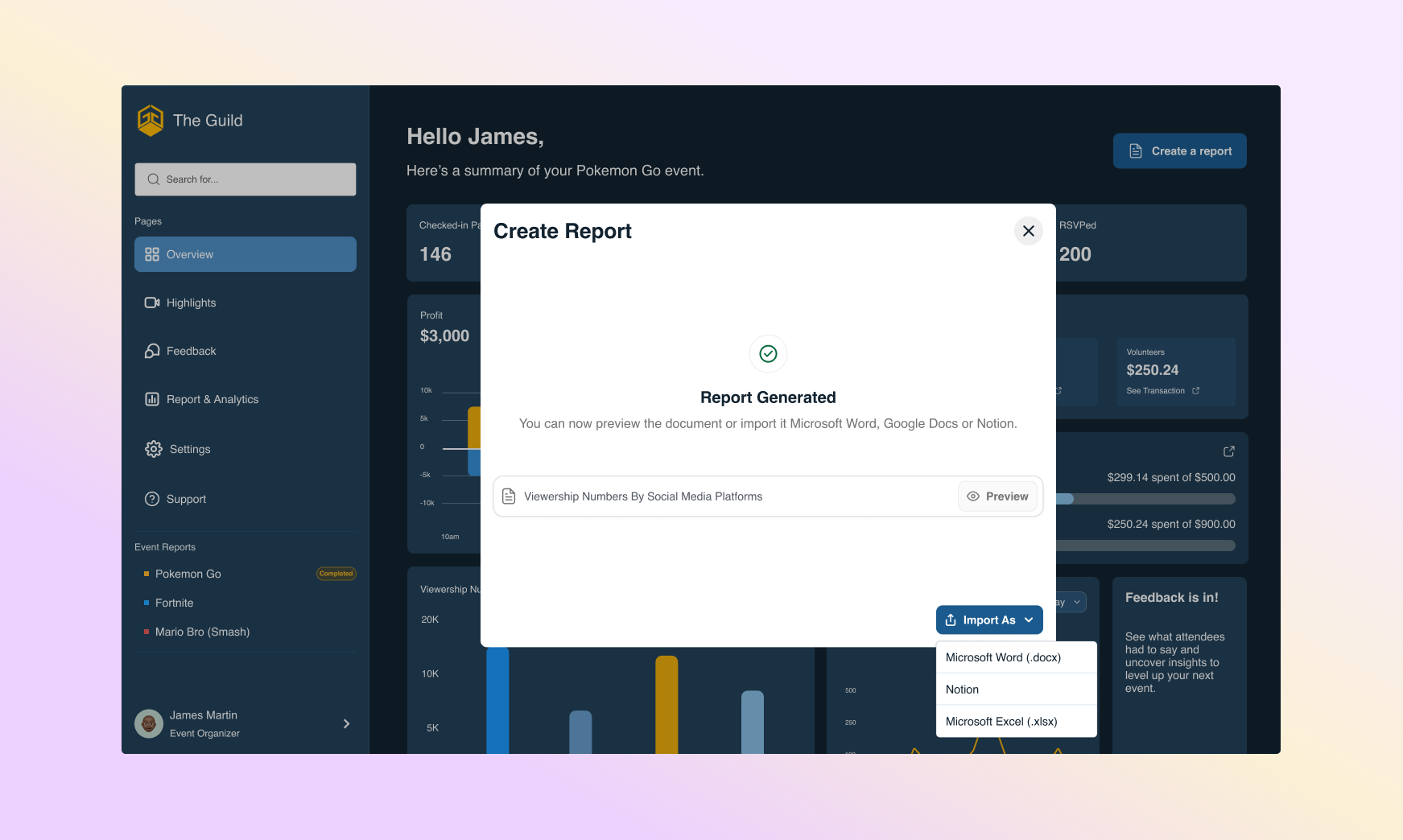
Additionally, organizers can import their reports in multiple formats, Notion, Microsoft Word, or Excel, giving them flexibility to present, document, or collaborate however they prefer.
Understanding the User
Using the gaming communities around Texas, we conducted a survey to understand the current post-event workflow of event organizers who have experience organizing tournaments in their various cities in TX. Our goal was to learn what application(s) are being used, the pain points, and the needs of our users to make their workflow seamless for understanding post-event outcomes.
Competitive Audit
Now that we've understood the users, our next focus was to see how we could potentially assist them by learning how platforms are making the best use of AI within data analytics.


1. SunDial.so
With SunDial AI's guided questions, users can ask broad business questions and receive clear, actionable reports in minutes. It uses guided questions to remove guesswork, helping users quickly understand their data and make confident decisions.
2. ThoughtSpot
ThoughtSpot's AI acts like a personal data analyst, helping users uncover insights and answer business questions in seconds. No technical skills required. Their dashboard approach emphasizes natural language queries and automated insights, making complex data analysis accessible to non-technical users.
3. Glean
Glean's AI leverages a company's internal data and knowledge to deliver insights that help improve key performance indicators (KPIs). It allows users to ask questions in plain English, delivering contextual AI responses based on company data.
Ideation
The key takeaway from our user research is that users prioritize efficiency, automated workflows, and simplicity. With these insights in mind, the main goal was to design a dashboard that leverages AI in assisting users by quickly deriving insights from analytical graphs.
Once the main goal was clear to us, we began exploring different ideas on how to utilize AI tailored to their specific need of quickly understanding post-event outcomes.
Our first exploration follows the concept of the platforms we conducted for our competitive audit, which have AI as their core functionality: embed into the analytical workflow. These dashboards are smart-live data analysts that provide users with insights into graphs, capable of having conversations and more.
Some of these applications include: Glean, Sundial, et al
Sundial's dashboard brings AI insights directly into the analytics workflow
Glean's AI Assistant
Our next exploration was the concept of conversational dashboards powered by Generative AI, uses features similarly to ChatGPT, Copilot, or Claude. These interfaces allow users to interact with data through natural language: asking questions, generating reports, or uncovering insights in a chat-like experience. Users get answers in real time through a conversational flow. This would be integrated directly into the dashboard.
Lastly, we have the AI-enhanced traditional dashboard. While it still presents data through static, predefined charts and filters, it now includes conversational features, allowing users to ask questions, explore data, and generate reports through a chat-like interface. This adds a more intuitive layer of interaction without changing the underlying dashboard experience.
ThoughtSpot's Liveboard
Landing on A Solution
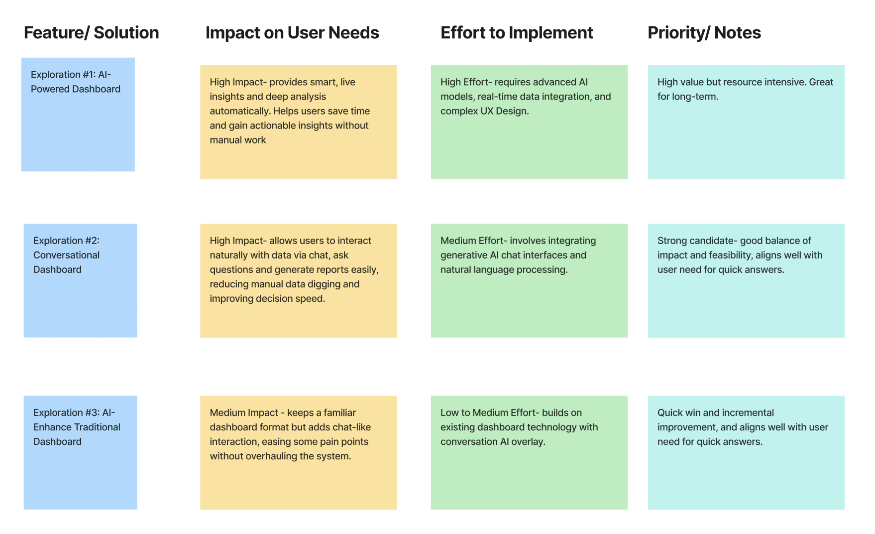
Prioritization Matrix (Click to enlarge)
To determine the best way to enhance our users' experience, the team and I developed a prioritization matrix. This led us to a hybrid solution—combining a traditional dashboard with conversational AI to deliver intuitive insights without disrupting familiar workflows for our users.
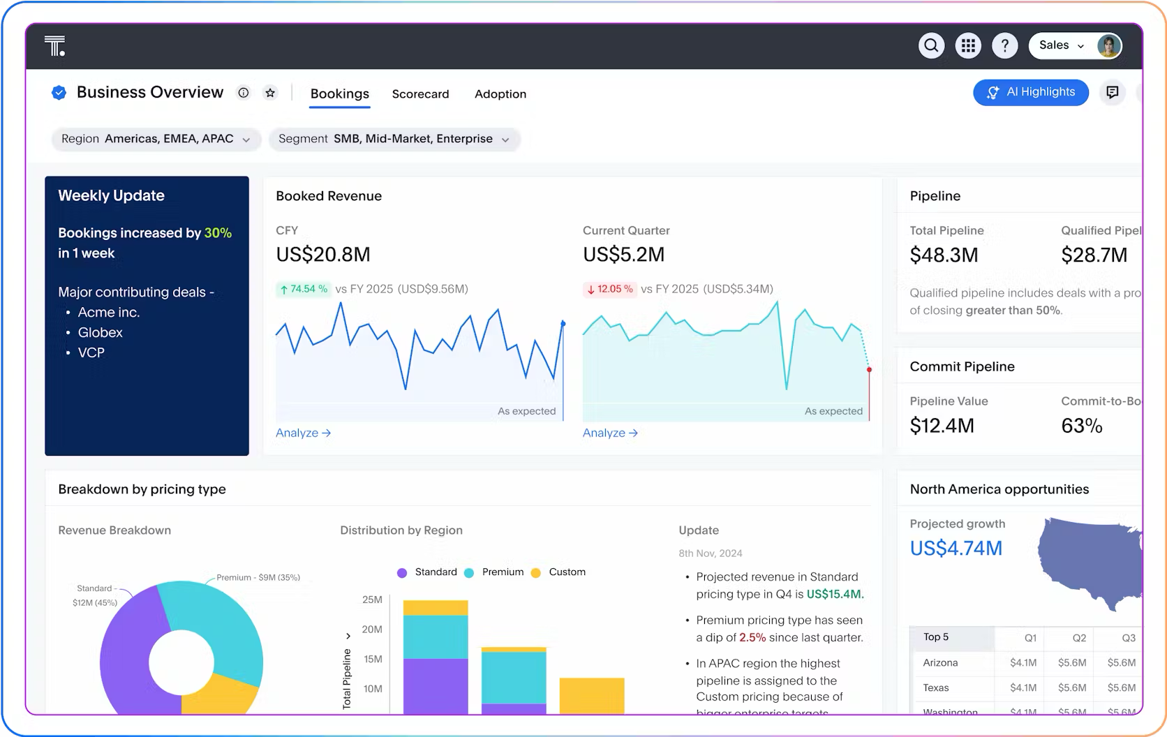
A Hybrid Dashboard Experience
No more scattered spreadsheets — just answers when you need them.
What I learned: This project was both exciting and educational as it deepened my understanding of AI's potential in analytics and reinforced the importance of staying up to date with emerging use cases that enhance user experiences. It also highlighted how crucial it is to design with our users' needs while considering their level of tech savviness, as neglecting this could result in a challenging learning curve for them.
Next Steps: The Product team looked into the possibility of both launching and beta testing the product to a target audience, but unfortunately, after our conversation with the stakeholders, they would not be moving forward with the direction of utilizing the dashboard.
What I'm Proud of: I am most proud of all the work that we were able to achieve within quite a short period, and I believe that with more time, we could have developed a much more valuable product for our users and assessed its usability and desirability.